Usage
On this page you’ll find usage guides about every one of the packages that together make up a Tiny Carousel ecosystem.
TIP
Always try to use proper semantic tags/attributes when setting up a carousel to make it accessible. Read more in W3C tutorial.
Core
The main package of the Tiny Carousel ecosystem which gives the most basic carousel API. Try it out before using additional plugins - it might be enough in the most basic scenarios.
First, you need to install the core library using one of the package managers:
# yarn
yarn add @frsource/tiny-carousel-core

# npm
npm install @frsource/tiny-carousel-core
To use this package you need to import both the SASS/CSS and Typescript/JavaScript files.
The animations in an example are not working.
By default, the core package disables scroll animations for some users to make the carousel accessible for the broader audience. If somebody (maybe you?) has the reduce motion option enabled in the system settings of his/her device the carousel will follow that rule and turn off the animations. To learn more, please read this article.
See the example below which uses only the core package:
<!-- You can navigate through slides using: scroll, arrows (first focus carousel with a click) or (on touch devices) swiping -->
<ul>
  <li>
    <img src="https://picsum.photos/seed/1/800/600">
  </li>
  <li>
    <img src="https://picsum.photos/seed/2/800/600">
  </li>
  <li>
    <img src="https://picsum.photos/seed/3/800/600">
  </li>
  <li>
    <img src="https://picsum.photos/seed/4/800/600">
  </li>
  <li>
    <img src="https://picsum.photos/seed/5/800/600">
  </li>
  <li>
    <img src="https://picsum.photos/seed/6/800/600">
  </li>
</ul>
@import "https://cdn.skypack.dev/@frsource/tiny-carousel-core/dist/index.css";

ul {
  list-style: none;
  margin: 0;
  padding: 0;
}
import { TinyCarousel } from 'https://cdn.skypack.dev/@frsource/tiny-carousel-core';

new TinyCarousel(
  document.querySelector('ul')
)
  .init();
TIP
Make sure to not override overflow: scroll styling on the carousel element - it`s necessary for library to work well!
That’s the most basic usage of the core package.
Next, we can try out using core JavaScript API to add next/previous buttons with only few lines of code:
<nav>
<button type="button" class="first"><<</button>
<button type="button" class="prev"><</button>
<button type="button" class="next">></button>
<button type="button" class="last">>></button>
</nav>
<ul>
<li>
<img src="https://picsum.photos/seed/1/800/600">
</li>
<li>
<img src="https://picsum.photos/seed/2/800/600">
</li>
<li>
<img src="https://picsum.photos/seed/3/800/600">
</li>
<li>
<img src="https://picsum.photos/seed/4/800/600">
</li>
<li>
<img src="https://picsum.photos/seed/5/800/600">
</li>
<li>
<img src="https://picsum.photos/seed/6/800/600">
</li>
</ul>
@import "https://cdn.skypack.dev/@frsource/tiny-carousel-core/dist/index.css";

ul {
  list-style: none;
  margin: 0;
  padding: 0;
}
import { TinyCarousel } from 'https://cdn.skypack.dev/@frsource/tiny-carousel-core';

const carousel = new TinyCarousel(
  document.querySelector('ul')
)
  .init();

// using .goTo method to go to the slide with an exact index number
document.querySelector('.first')
  .addEventListener(
    'click',
    () => carousel.goTo(0)
  );

// using .prev method
document.querySelector('.prev')
  .addEventListener(
    'click',
    () => carousel.prev()
  );

// using .next method
document.querySelector('.next')
  .addEventListener(
    'click',
    () => carousel.next()
  );

// passing negative number as an argument to the .goTo method will make it count slides from the end (-1 being the last slide)
document.querySelector('.last')
  .addEventListener(
    'click',
    () => carousel.goTo(-1)
  );
In most cases, the same functionality can be obtained using proper Tiny Carousel plugin - we’ve got you covered! But, if you ever find yourself in a situation where you need to do something more custom - know that Tiny Carousel JavaScript API is there and is ready to be used! Read more in the API docs for core package.
React
This package integrates Tiny Carousel into React. More detailed info about the API can be found here.
To start, you need to install the integration:
# yarn
yarn add @frsource/tiny-carousel-react

# npm
npm install @frsource/tiny-carousel-react
Now let’s see how to add the TinyCarousel to your React application.
<p>Use arrows or scroll (or swipes on a mobile device) to change slides</p>

<div id="root"></div>
@import "https://cdn.skypack.dev/@frsource/tiny-carousel-core/dist/index.css";

ul {
  list-style: none;
  margin: 0;
  padding: 0;
}
// needed because of UMD build
// it's an equivalent of
// import TinyCarousel from "@frsource/tiny-carousel-react";
const TinyCarousel = window.tinyCarouselReact.default;

function App() {
  const [number, setNumber] = React.useState(6);

  return (
    <TinyCarousel>
      {new Array(number).fill(1).map(
          (_, index) =>
      <li key={index}>
          <img
            className="carousel__item-img"
            alt={`Demo ${index}`}
            src={`https://picsum.photos/seed/${index + 1}/800/600`}
          />
          </li>
        )
      }
    </TinyCarousel>
  );
}

ReactDOM.render(
  <App />,
  document.getElementById('root')
);
TinyCarousel React component give you possibility to configure carousel, import TinyCarousel plugins, customize tag name and use listen for custom events. To know more about the event handling read React TinyCarousel API reference or have a look at the advanced example below:
<p>Use arrows or scroll (or swipes on a mobile device) to change slides</p>

<div id="root"></div>
@import "https://cdn.skypack.dev/@frsource/tiny-carousel-core/dist/index.css";

ul {
  list-style: none;
  margin: 0;
  padding: 0;
}
// needed because of skypack/codepen limitations
// it's an equivalent of e.g.:
// import TinyCarousel from "@frsource/tiny-carousel-react";
// and
// import { pluginCustomEvents } from '@frsource/tiny-carousel-plugin-custom-events';
const {
  default: TinyCarousel,
  definePlugin,
  PluginsProp,
  TinyCarouselProps,
  TinyCarouselRef
} = window.tinyCarouselReact;
const { pluginAutoplay } = window.tinyCarouselPluginAutoplay;
const { pluginCustomEvents } = window.tinyCarouselPluginCustomEvents;

const carouselPlugins: PluginsProp = [
  definePlugin(pluginAutoplay, {
    autoplayTimeout: 4000,
  }),
  definePlugin(pluginCustomEvents),
];

function App() {
  const [number, setNumber] = React.useState(6);
  const [isInitialized, setIsInitialized] = React.useState(false);
  const tinyCarousel = React.useRef<TinyCarouselRef>(null);
  const onCarouselInit: TinyCarouselProps['onAfterEventInit'] = e => {
    setIsInitialized(true);
    e.detail.tinyCarousel.play();
  };
  const clickPrev = () => tinyCarousel.current?.prev();
  const clickNext = () => tinyCarousel.current?.next();

  return (
  <main>
    <p className="carousel-status">Carousel is { isInitialized ? 'initialized' : 'not initialized' }</p>

    <TinyCarousel
      className="carousel"
      tag="section"
      plugins={carouselPlugins}
      onAfterEventInit={onCarouselInit}
      ref={tinyCarousel}
    >
      {new Array(number).fill(1).map(
          (_, index) =>
      <article key={index}>
          <img
            className="carousel__item-img"
            alt={`Demo ${index}`}
            src={`https://picsum.photos/seed/${index + 1}/800/600`}
          />
          </article>
        )
      }
    </TinyCarousel>

    <nav className="row">
      <button type="button" onClick={clickPrev}>prev</button>
      <button type="button" onClick={clickNext}>next</button>
      <button type="button" onClick={() => setNumber(number + 1)}>Add slide</button>
      <button type="button" onClick={() => setNumber(number - 1)}>Remove slide</button>
    </nav>
  </main>
  );
}

ReactDOM.render(
  <App />,
  document.getElementById('root')
);
Vue
This package integrates Tiny Carousel into Vue. More detailed info about the API can be found here.
To start, you need to install the integration:
# yarn
yarn add @frsource/tiny-carousel-vue

# npm
npm install @frsource/tiny-carousel-vue
Now let’s see how to add the TinyCarousel to your Vue 3 application.
TIP
Still developing Vue 2 application? Don’t worry! Click here to see the Vue 2 example.
Vue 3
First, the most basic example of how to add Tiny Carousel to your Vue 3 application:
<p>Use arrows or scroll (or swipes on a mobile device) to change slides</p>

<div id="app"></div>

<script type="text/x-template" id="app-template">

  <TinyCarousel>
    <li v-for="index in numberOfSlides" :key="index">
      <img
        class="carousel__item-img"
        :src="`https://picsum.photos/seed/${index}/800/600`"
      >
    </li>
  </TinyCarousel>

</script>
@import "https://cdn.skypack.dev/@frsource/tiny-carousel-core/dist/index.css";

ul {
  list-style: none;
  margin: 0;
  padding: 0;
}
// needed because of skypack/codepen limitations
// in regular codebase use
// import * as Vue from "vue";
// import TinyCarousel from "@frsource/tiny-carousel-vue";
// instead of the two lines below:
const { createApp, ref, watch, computed } = window.Vue;
const TinyCarousel = window.tinyCarouselVue.default;

const App = {
  name: 'App',
  template: '#app-template',
  components: {
    TinyCarousel,
  },
  data() {
    return {
      numberOfSlides: 4,
    };
  }
};

createApp(App)
  .mount('#app');
That’s the most basic usage, but Vue integration allows you to do much more than that!
TinyCarousel component allows you to use any of the Tiny Carousel plugins, access carousel instance directly or change the carousel root element`s tag name to something custom. Let’s try it out in the next example:
<div id="app"></div>

<script type="text/x-template" id="app-template">

  <main>
    <p>Carousel is {{ isInitialized ? 'initialized' : 'not initialized' }}</p>

    <TinyCarousel
      ref="tinyCarousel"
      tag="section"
      :plugins="carouselPlugins"
      @after:init="isInitialized = true"
    >
      <article v-for="index in numberOfSlides" :key="index">
        <img
          class="carousel__item-img"
          :src="`https://picsum.photos/seed/${index}/800/600`"
        >
      </article>
    </TinyCarousel>

    <nav>
      <button type="button" @click="carousel?.prev()">prev</button>
      <button type="button" @click="carousel?.next()">next</button>
    </nav>
    <div>
      <button type="button" @click="++numberOfSlides">Add slide</button>
      <button type="button" @click="--numberOfSlides">Remove slide</button>
    </div>
  </main>

</script>
@import "https://cdn.skypack.dev/@frsource/tiny-carousel-core/dist/index.css";

ul {
  list-style: none;
  margin: 0;
  padding: 0;
}
// needed because of skypack/codepen limitations
// in regular codebase use
// import TinyCarousel from "@frsource/tiny-carousel-vue";
// or
// import { pluginCustomEvents } from '@frsource/tiny-carousel-plugin-custom-events';
// instead of the three lines below:
const { createApp, ref, watch, computed } = window.Vue;
const {
  default: TinyCarousel,
  definePlugin,
  PluginsProp,
  TinyCarouselComponent
} = window.tinyCarouselVue;
const { pluginAutoplay } = window.tinyCarouselPluginAutoplay;
const { pluginCustomEvents } = window.tinyCarouselPluginCustomEvents;

const App = {
  name: 'App',
  template: '#app-template',
  components: {
    TinyCarousel,
  },
  setup() {
    const tinyCarousel = ref();
    const carousel = computed(() => tinyCarousel.value?.carousel);
    const carouselPlugins: PluginsProp = [
      definePlugin(pluginAutoplay, {
        autoplayTimeout: 5000,
      }),
      // adds triggering of the custom events
      definePlugin(pluginCustomEvents),
    ];

    watch(carousel, carousel => {
      carousel?.play();
    });

    return {
      numberOfSlides: ref(6),
      carouselPlugins,
      isInitialized: ref(false),
      tinyCarousel,
      carousel,
    };
  }
};

createApp(App)
  .mount('#app');
Vue 2
Next, follow the basic example of how to add Tiny Carousel to your Vue 2 application:
<p>Use arrows or scroll (or swipes on a mobile device) to change slides</p>

<div id="app"></div>

<script type="text/x-template" id="app-template">

  <TinyCarousel>
    <li v-for="index in numberOfSlides" :key="index">
      <img
        class="carousel__item-img"
        :src="`https://picsum.photos/seed/${index}/800/600`"
      >
    </li>
  </TinyCarousel>

</script>
@import "https://cdn.skypack.dev/@frsource/tiny-carousel-core/dist/index.css";

ul {
  list-style: none;
  margin: 0;
  padding: 0;
}
import Vue from 'https://cdn.jsdelivr.net/npm/vue@2/dist/vue.esm.browser.js';
import TinyCarousel from 'https://cdn.skypack.dev/@frsource/tiny-carousel-vue';

const App = {
  name: 'App',
  template: '#app-template',
  components: {
    TinyCarousel
  },
  data() {
    return {
      numberOfSlides: 4,
    };
  }
};

new Vue({
  el: '#app',
  template: '<App/>',
  components: { App }
})
In the more advanced usage example let’s see how you can use any of the Tiny Carousel plugins, access carousel instance directly or change the carousel root element`s tag name to something custom:
<div id="app"></div>

<script type="text/x-template" id="app-template">

  <main>
    <p>Carousel is {{ isInitialized ? 'initialized' : 'not initialized' }}</p>

    <TinyCarousel
      ref="tinyCarousel"
      tag="section"
      :plugins="carouselPlugins"
      @after:init="isInitialized = true"
    >
      <article v-for="index in numberOfSlides" :key="index">
        <img
          class="carousel__item-img"
          :src="`https://picsum.photos/seed/${index}/800/600`"
        >
      </article>
    </TinyCarousel>

    <nav>
      <button type="button" @click="clickPrev">prev</button>
      <button type="button" @click="clickNext">next</button>
    </nav>
    <div>
      <button type="button" @click="++numberOfSlides">Add slide</button>
      <button type="button" @click="--numberOfSlides">Remove slide</button>
    </div>
  </main>

</script>
@import "https://cdn.skypack.dev/@frsource/tiny-carousel-core/dist/index.css";
import Vue from 'https://cdn.jsdelivr.net/npm/vue@2/dist/vue.esm.browser.js';
import { pluginAutoplay } from 'https://cdn.skypack.dev/@frsource/tiny-carousel-plugin-autoplay';
import { pluginCustomEvents } from 'https://cdn.skypack.dev/@frsource/tiny-carousel-plugin-custom-events';
import TinyCarousel, { definePlugin, PluginsProp, TinyCarouselComponent } from 'https://cdn.skypack.dev/@frsource/tiny-carousel-vue';

const App = {
  name: 'App',
  template: '#app-template',
  components: {
    TinyCarousel
  },
  data() {
    const carouselPlugins: PluginsProp = [
      definePlugin(pluginAutoplay, {
        autoplayTimeout: 5000,
      }),
      // adds triggering of the custom events
      definePlugin(pluginCustomEvents),
    ];
    return {
      numberOfSlides: 6,
      carouselPlugins,
      isInitialized: false,
    };
  },
  computed: {
    carousel() {
      return (this.$refs.tinyCarousel as TinyCarouselComponent | undefined)?.carousel;
    }
  },
  async updated() {
    // always let the TinyCarousel to be rendered first
    // before accessing carousel instance
    await this.$nextTick()
    this.carousel?.play();
  },
  methods: {
    clickPrev() {
      this.carousel?.prev();
    },
    clickNext() {
      this.carousel?.next();
    }
  }
};

new Vue({
  el: '#app',
  template: '<App/>',
  components: { App }
});
Plugin Autoplay
This plugin adds autoplay feature to the Tiny Carousel. Also, it extends Tiny Carousel instance with additional methods for event handling.
More detailed info about the plugin’s API can be found here.
To install the plugin use one of the commands below:
# yarn
yarn add @frsource/tiny-carousel-plugin-autoplay

# npm
npm install @frsource/tiny-carousel-plugin-autoplay
Prerequisites
This plugin requires to explicitly install @frsource/tiny-carousel-plugin-custom-events as your project`s dependency. You might need to run additional installation commands before using the Plugin Autoplay for the first time:
# yarn
yarn add @frsource/tiny-carousel-plugin-custom-events

# npm
npm install @frsource/tiny-carousel-plugin-custom-events
After installation, you need to add the plugin to your Tiny Carousel instance using carousel.use method. Provide it with the options object to override the default configuration.
For reference and information about the defaults, please see PluginConfig documentation page or have a look at the example below:
<button class="play" type="button">PLAY</button>
<button class="pause" type="button">PAUSE</button>

<ul>
  <li>
    <img src="https://picsum.photos/seed/1/800/600">
  </li>
  <li>
    <img src="https://picsum.photos/seed/2/800/600">
  </li>
  <li>
    <img src="https://picsum.photos/seed/3/800/600">
  </li>
  <li>
    <img src="https://picsum.photos/seed/4/800/600">
  </li>
</ul>
@import "https://cdn.skypack.dev/@frsource/tiny-carousel-core/dist/index.css";

ul {
  list-style: none;
  margin: 0;
  padding: 0;
}
import { TinyCarousel } from 'https://cdn.skypack.dev/@frsource/tiny-carousel-core';
import { pluginAutoplay } from 'https://cdn.skypack.dev/@frsource/tiny-carousel-plugin-autoplay';

const carousel = new TinyCarousel(
  document.querySelector('ul')
)
  .use(pluginAutoplay, {
    autoplayTimeout: 3000,
    // [ms] default value is 4000
    autoplayImmediate: false,
    // whether to change first slide right after the play action or after a timeout, default value: false
    pauseOnHover: true,
    // should the carousel be paused on hover, default value: true
  })
  .init()
  // to autoplay the carousel on page load
  // just uncomment the line below:
  // .play();

document.querySelector('.play')
  .addEventListener('click',
    () => carousel.play()
  );

document.querySelector('.pause')
  .addEventListener('click',
    () => carousel.pause()
  );
Plugin Custom Events
This plugin triggers CustomEvents for the most important methods of the Core Tiny Carousel API. Also, it extends Tiny Carousel instance with additional methods for the event handling.
API Reference and the list of all events raised by this plugin you will find here.
Let’s try to use it - first you need to install the plugin using one of a package managers:
# yarn
yarn add @frsource/tiny-carousel-plugin-custom-events

# npm
npm install @frsource/tiny-carousel-plugin-custom-events
Then, add it to your carousel instance using carousel.use method. That’s it, now you can use methods newly added by the Tiny Carousel Plugin Custom Events, like carousel.on() on the example below:
<h3>Tiny Carousel is not loaded yet ⏳</h3>

<ul>
  <li>
    <img src="https://picsum.photos/seed/1/800/600">
  </li>
  <li>
    <img src="https://picsum.photos/seed/2/800/600">
  </li>
  <li>
    <img src="https://picsum.photos/seed/3/800/600">
  </li>
  <li>
    <img src="https://picsum.photos/seed/4/800/600">
  </li>
</ul>
@import "https://cdn.skypack.dev/@frsource/tiny-carousel-core/dist/index.css";

ul {
  list-style: none;
  margin: 0;
  padding: 0;
}
import { TinyCarousel } from 'https://cdn.skypack.dev/@frsource/tiny-carousel-core';
import { pluginCustomEvents } from 'https://cdn.skypack.dev/@frsource/tiny-carousel-plugin-custom-events';

const carousel = new TinyCarousel(
  document.querySelector('ul')
)
  .use(pluginCustomEvents)
/**
 * Let's add custom event handler to
 * show the message
 * after the carousel is loaded
 **/
  .on('after:init', () => {
    document.querySelector('h3')
      .textContent = 'Carousel has been loaded! 🚀';
  })
/**
 * Here let`s log carousel items
 * every time findPossibleItems
 * method finishes it`s job
 **/
  .on('after:find-possible-items', (e) => {
    console.log(e);
  })
  .init();
Plugin Mouse Drag
This plugin adds drag/swipe support for mouse users (especially on desktop).
API Reference and the list of all events raised by this plugin you will find here.
To use this package you need to import both the SASS/CSS and Typescript/JavaScript files.
Let’s try to use it - first you need to install the plugin using one of a package managers:
# yarn
yarn add @frsource/tiny-carousel-plugin-mouse-drag

# npm
npm install @frsource/tiny-carousel-plugin-mouse-drag
After you add it to your carousel instance (using carousel.use method) and import CSS/Sass styling the plugin will start working immediately! From now on, every desktop/mouse user will be able to swipe through the slides by clicking & dragging across the carousel.
See the example below on the device with mouse connected to see the plugin in action:
<h3>The carousel is now swipeable, even on desktop 🖐</h3>

<ul>
  <li>
    <img src="https://picsum.photos/seed/1/800/600">
  </li>
  <li>
    <img src="https://picsum.photos/seed/2/800/600">
  </li>
  <li>
    <img src="https://picsum.photos/seed/3/800/600">
  </li>
  <li>
    <img src="https://picsum.photos/seed/4/800/600">
  </li>
</ul>
@import "https://cdn.skypack.dev/@frsource/tiny-carousel-core/dist/index.css";
@import "https://cdn.skypack.dev/@frsource/tiny-carousel-plugin-mouse-drag/dist/index.css";

ul {
  list-style: none;
  margin: 0;
  padding: 0;
}
import { TinyCarousel } from 'https://cdn.skypack.dev/@frsource/tiny-carousel-core';
import { pluginMouseDrag } from 'https://cdn.skypack.dev/@frsource/tiny-carousel-plugin-mouse-drag';

const carousel = new TinyCarousel(
  document.querySelector('ul')
)
  .use(
    pluginMouseDrag,
    // you can pass along an configuration object
    // for all options please refer to:
    // https://www.frsource.org/tiny-carousel/api-reference/plugin-mouse-drag/#pluginconfig
    // uncomment the line below to try out
    // swiping with smaller gravity
    // { mouseDragMomentumGravity: 0.5 }
  )
  .init();
Plugin Scroll Snap Fallback
Even though the browser support of the CSS scroll-snap feature is pretty good:
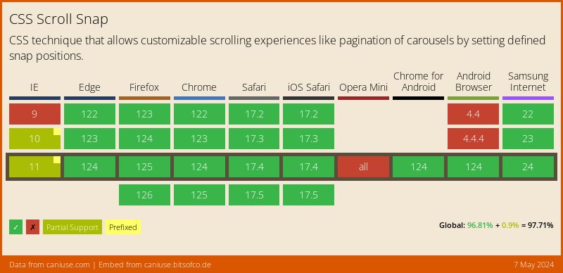
You might sometimes find yourself in a situation where you need to support users of the older browsers. Scroll Snap Fallback Plugin handles exactly this case! It provides the most simplistic polyfill of CSS scroll-snap feature, so you’ve got your users covered!
First install it via your favorite package manager:
# yarn
yarn add @frsource/tiny-carousel-plugin-scroll-snap-fallback

# npm
npm install @frsource/tiny-carousel-plugin-scroll-snap-fallback
Then, add it to your carousel instance using carousel.use method, as shown on the example below:
<!-- This example works on IE9 and Chrome 69- -->
<!-- You can navigate through slides using: scroll, arrows (first focus carousel with a click) or (on touch devices) swiping -->

<ul>
  <li>
    <img src="https://picsum.photos/seed/1/800/600">
  </li>
  <li>
    <img src="https://picsum.photos/seed/2/800/600">
  </li>
  <li>
    <img src="https://picsum.photos/seed/3/800/600">
  </li>
  <li>
    <img src="https://picsum.photos/seed/4/800/600">
  </li>
</ul>
@import "https://cdn.skypack.dev/@frsource/tiny-carousel-core/dist/index.css";

ul {
  list-style: none;
  margin: 0;
  padding: 0;
}
import { TinyCarousel } from 'https://cdn.skypack.dev/@frsource/tiny-carousel-core';
import { pluginScrollSnapFallback } from 'https://cdn.skypack.dev/@frsource/tiny-carousel-plugin-scroll-snap-fallback';

const carousel = new TinyCarousel(
  document.querySelector('ul')
)
  .use(
    pluginScrollSnapFallback,
    // you can pass along an configuration object
    // for all options please refer to:
    // https://www.frsource.org/tiny-carousel/api-reference/plugin-scroll-snap-fallback/#pluginconfig
    //{ force: true }
  )
  .init();
That’s it - the polyfill will be automatically added to your carousel instance whenever CSS scroll-snap feature is not supported!
For information about plugin options, please head to it`s API reference.
Help us improve the documentation
Hey, it seems you’ve made it to the very bottom of our usage guide! Thank you for taking such interest in our library - we hope it will make your journey easier! ✈️
However, if you feel that something could be described better or if you saw any typo/error please feel free to use the "Help us improve this page on GitHub" button placed on the very bottom of this page. Don’t hesitate to write a suggestion in the "issues" tab or file a PR with a fix!
Thank you! Any help is kindly appreciated 🙏
For further information about the possible configuration options and useful methods, please have a look at our API reference.